Canberra Art Biennial
About the project
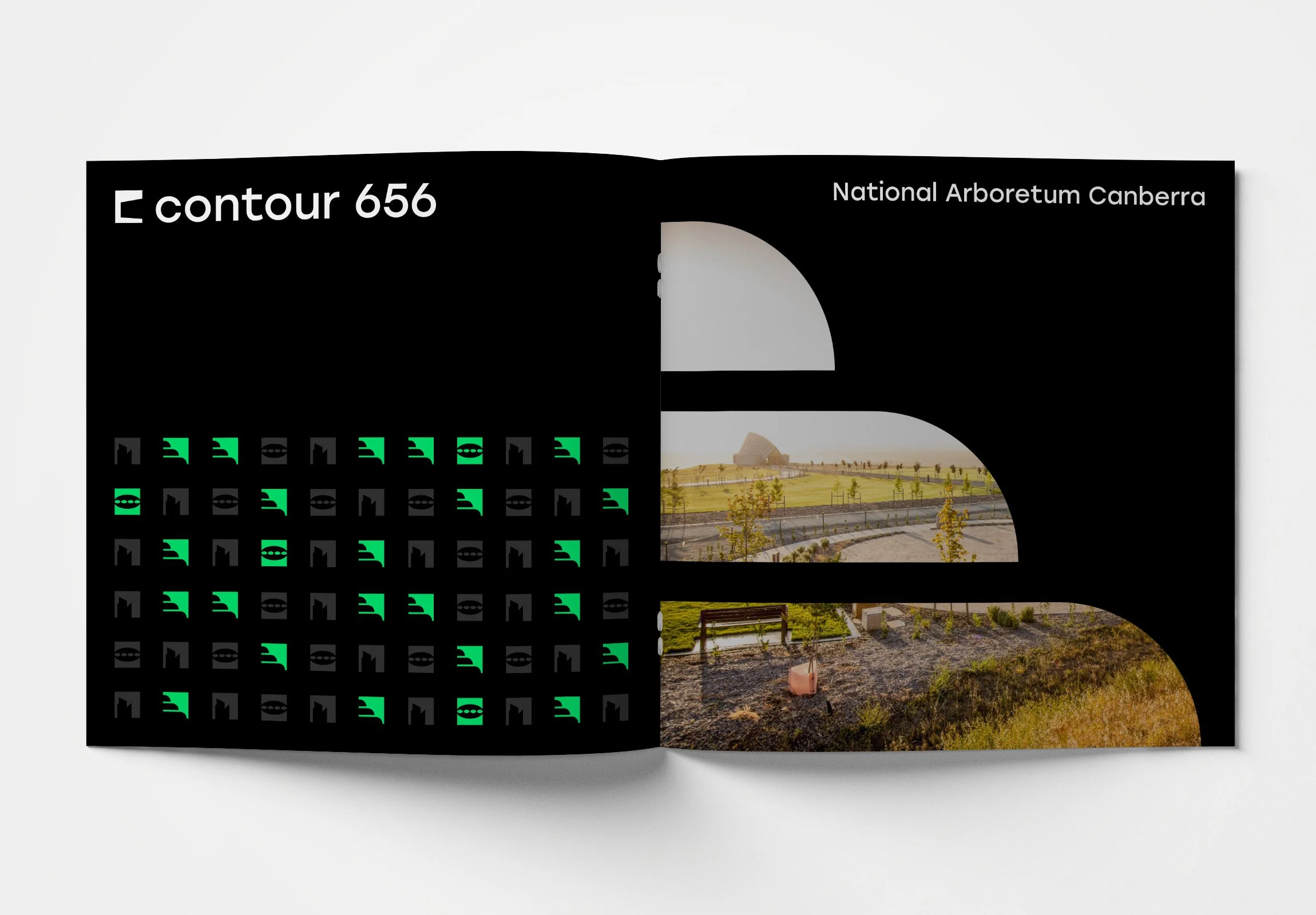
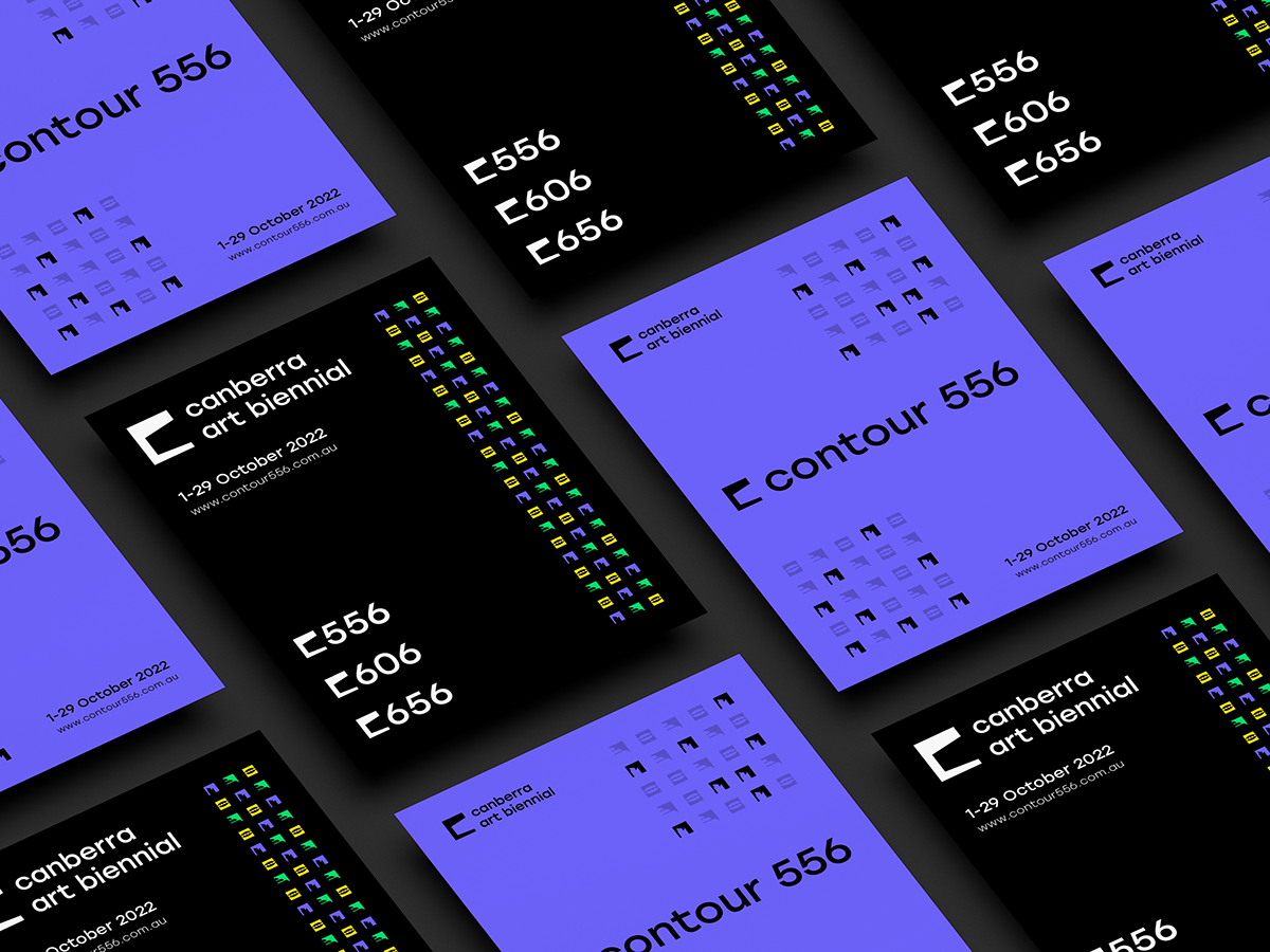
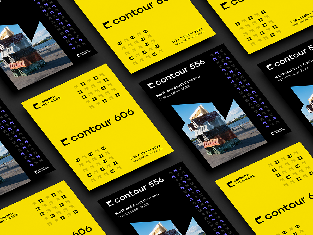
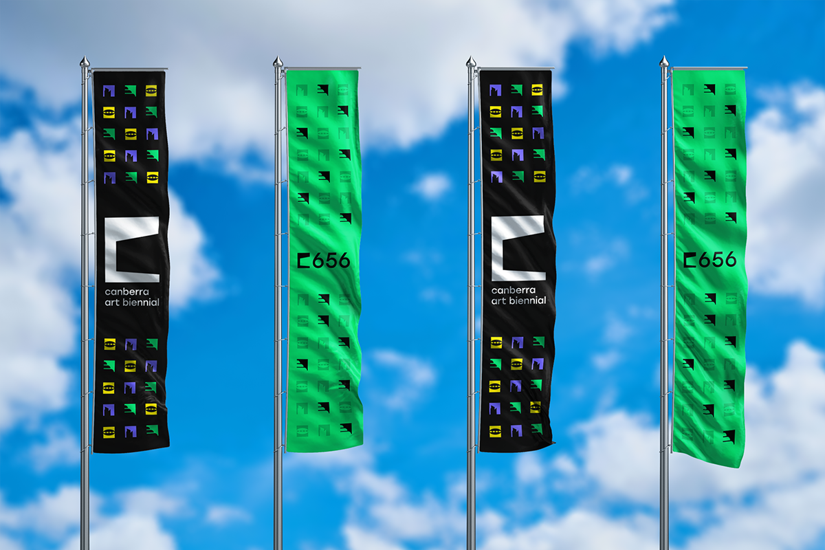
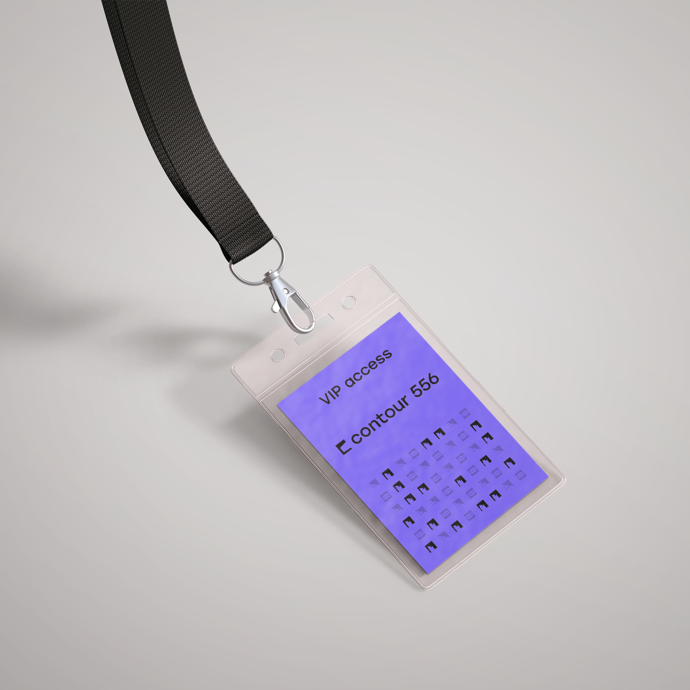
The Canberra Art Biennial is a month-long contemporary public art festival held every two years across Canberra, curated by Neil Hobbs. Formerly known as contour 556 and centred in the inner city, the festival expanded in 2022 to include two additional sites: the University of Canberra (contour 606) and the National Arboretum (contour 656). Each site name references its elevation above sea level, linking the locations back to Canberra’s landscape and history.
As part of a university project, my team was briefed to create a new overarching brand to reflect the festival’s growth. We developed a refreshed identity with a modern interpretation of the “contour” concept, supported by a clear sub-brand system for each site. The new branding was designed to feel contemporary and bold, strengthen recognition across multiple locations, and appeal to a diverse audience of artists, locals, and visitors.
Out of multiple teams, our concept was selected by Neil as the new face of the Canberra Art Biennial. Since graduating, I’ve continued supporting the festival through freelance design, creating additional promotional materials and signage. The result is a consistent brand experience that connects artists, audiences, and place, strengthening the Biennial’s visibility and reach across Canberra.
All intellectual property for this work is owned by the Canberra Art Biennial.
Services
Brand refresh and visual identity
Sub-brand system design
Logo design and iconography
Brand patterns and visual elements
Print and publication design
Promotional and environmental design
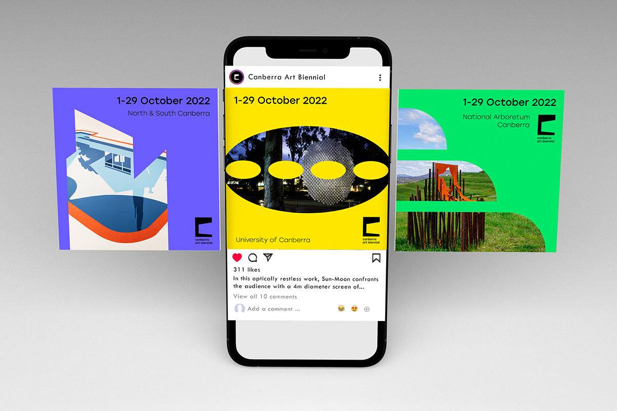
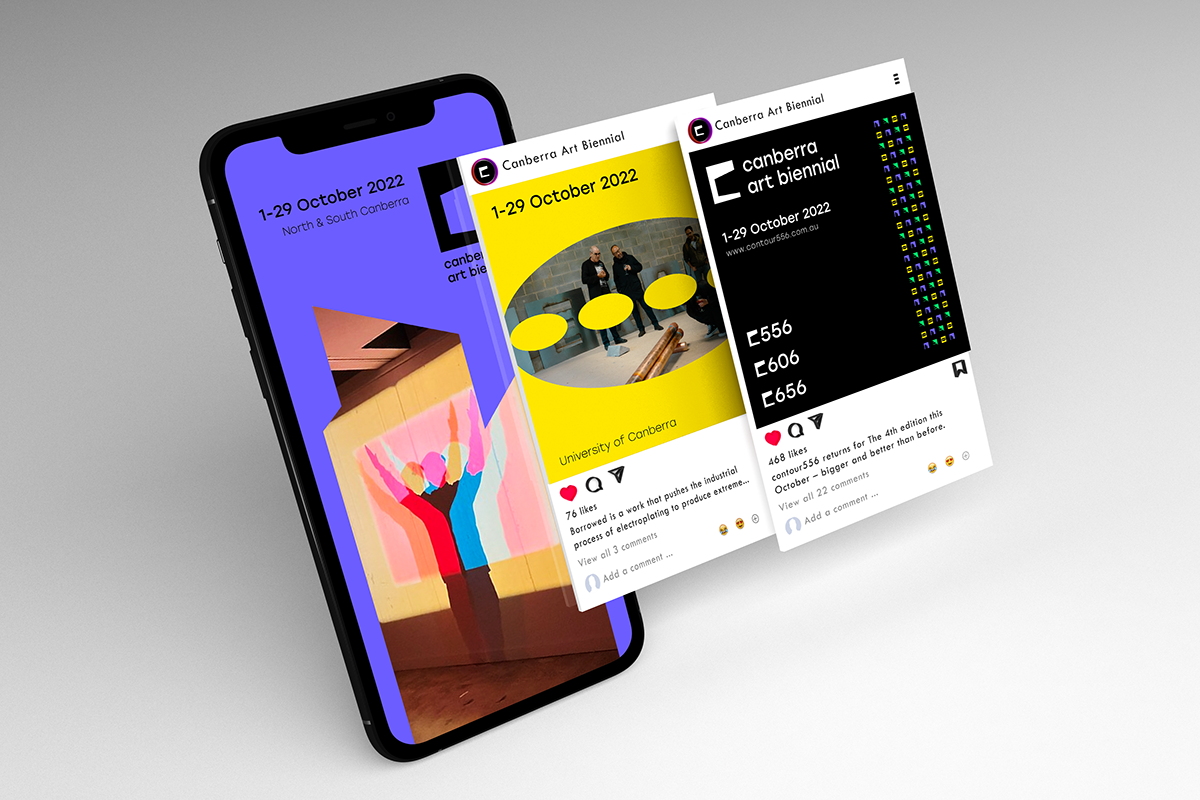
Social media design
Position: Freelancing and University Student
Timeframe: Oct 2021 - Dec 2022
Branding
Concept
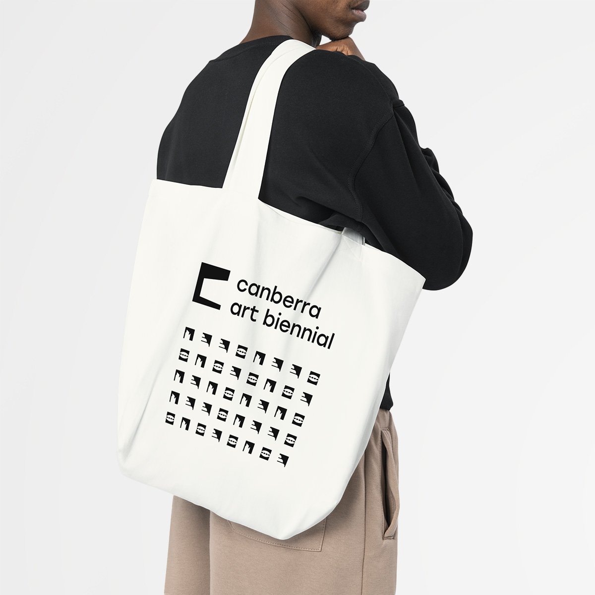
This logomark combines a recognisable icon of Canberra with the idea of a frame. It reflects how art can influence what we notice and how we interpret it by drawing focus, shaping context, and encouraging a different point of view.
Parliament House is formed in the negative space as the central subject, grounding the Biennial in Canberra’s landscape and identity. The surrounding frame represents Canberra Art Biennial’s role in presenting and guiding audiences through work across the city. It also speaks to the festival’s purpose of helping people better understand the different layers of Canberra’s history and stories by asking them to pause, look closer, and see familiar places in a new way.
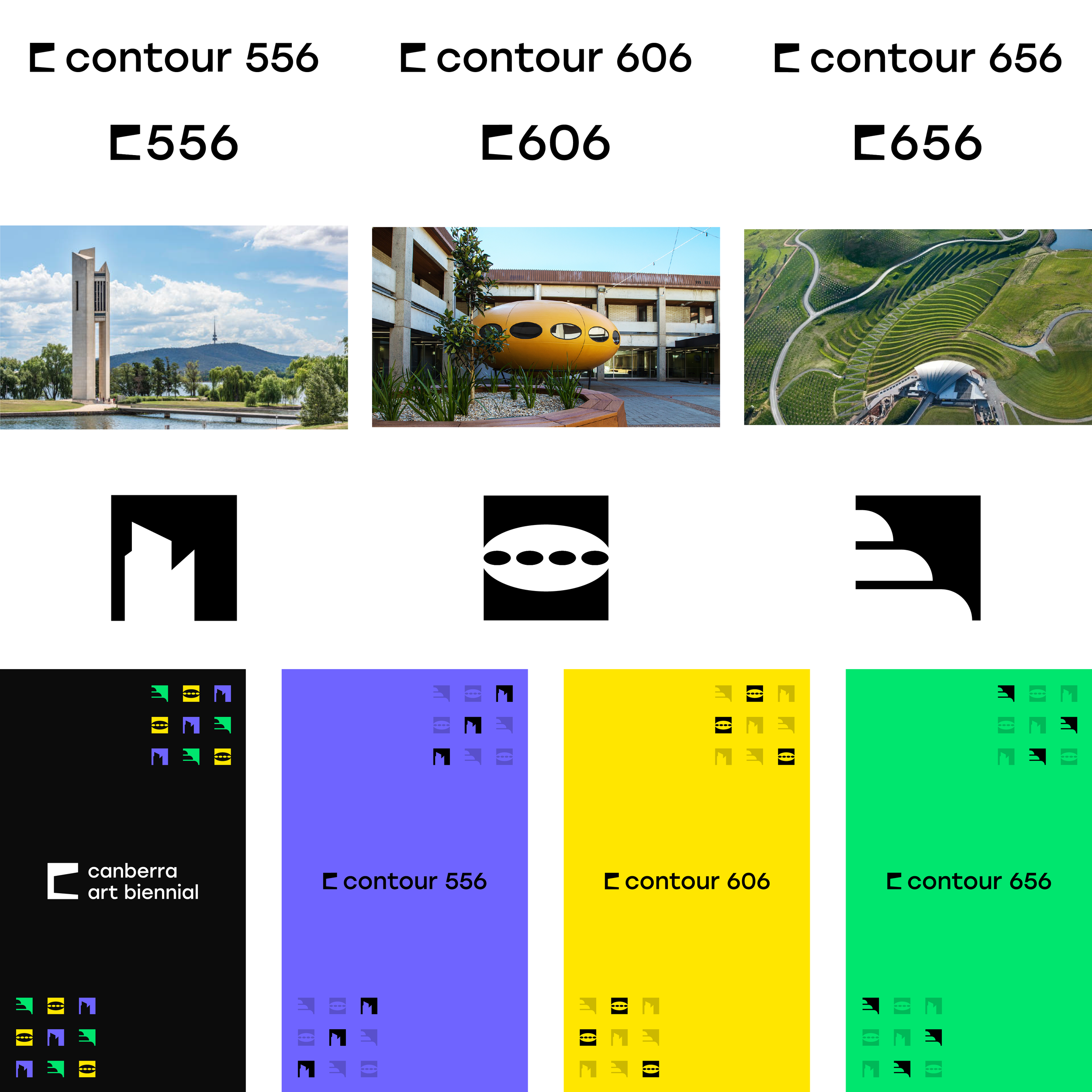
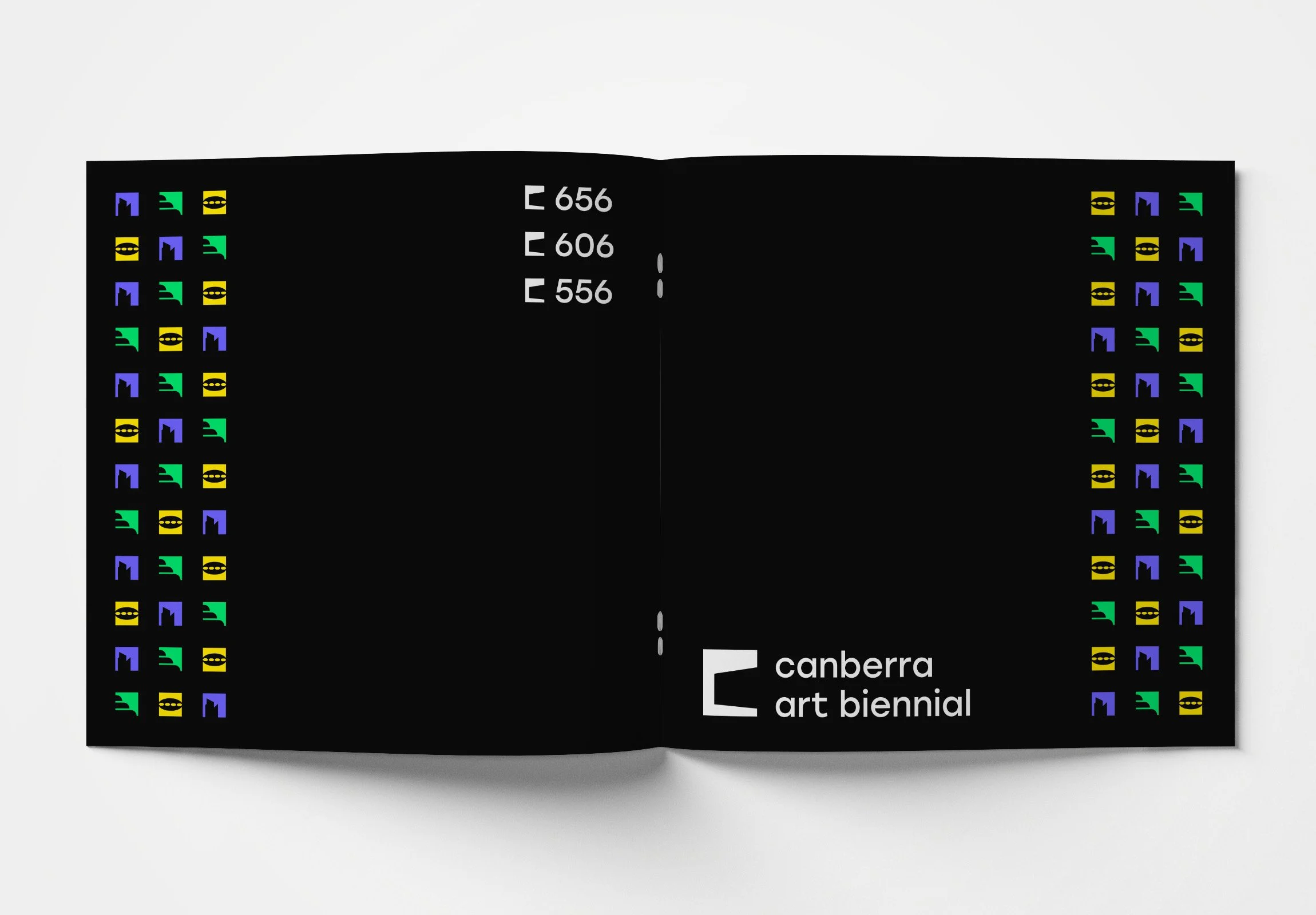
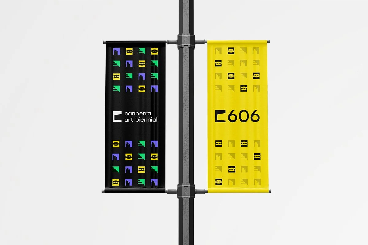
Extended brand identity
The overarching brand mark flows down smoothly for each of the three sites. Each site also has an alternative icon that acts as a unique identifier. These unique icons expand on the concept for the brand mark by depicting a landmark from its site in the same treatment. When combined these icons form patterns that offer both consistency across the brand, and more personality for each of the three sub-brands.
Colour scheme
A vivid colour scheme paired well with the bold and contemporary logomark. It is evocative just like the Canberra Art Biennial festival.
Applications
Social media